Existing home inventory, in living color
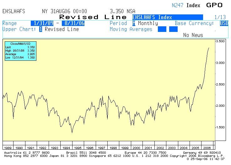 Okay, so maybe it's not living color. It's more like "faint yellow" color, with a bit of blue thrown in for good measure. But the most important thing in this chart isn't the colors. It's the black line. It shows the number of existing, single-family homes for sale (the NAR also reports TOTAL inventory, including condos and coops, but I don't have that data going back as far).
You can see that SFH inventory is up 36% from August 2005 and a whopping 51.6% from August 2004. You can also see that we have not had anything like this explosion in supply anytime in recent history. Does this look like the makings of a soft landing to you?
posted by Mike Larson at
12:03 PM
![]()
![]()


0 Comments:
Post a Comment
<< Home